Cadre
The world of fintech 💸
Easier access to transparent real estate investments.
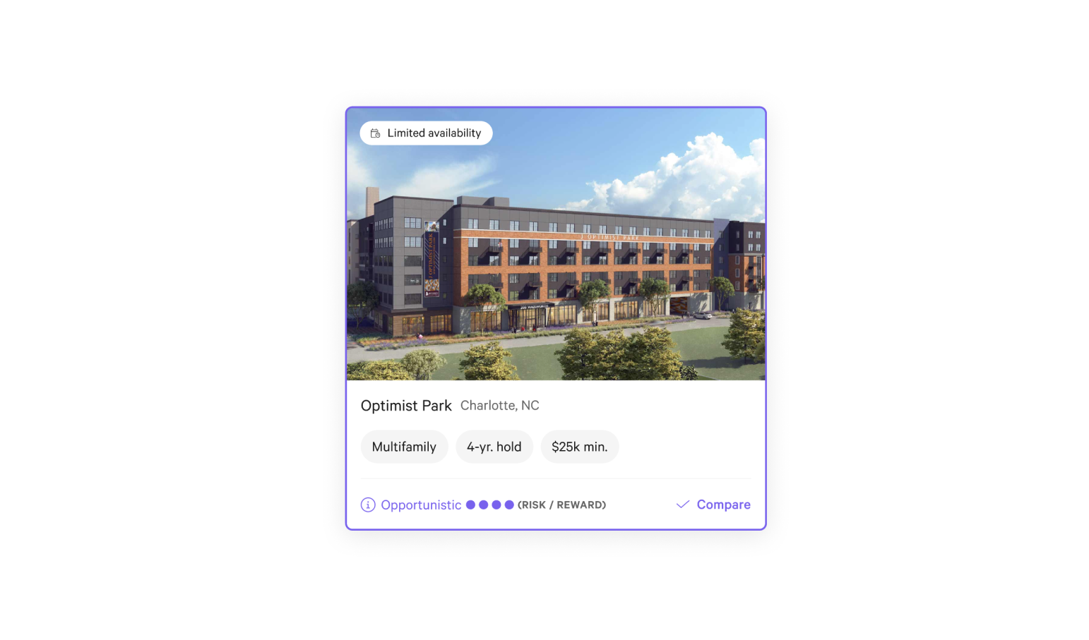
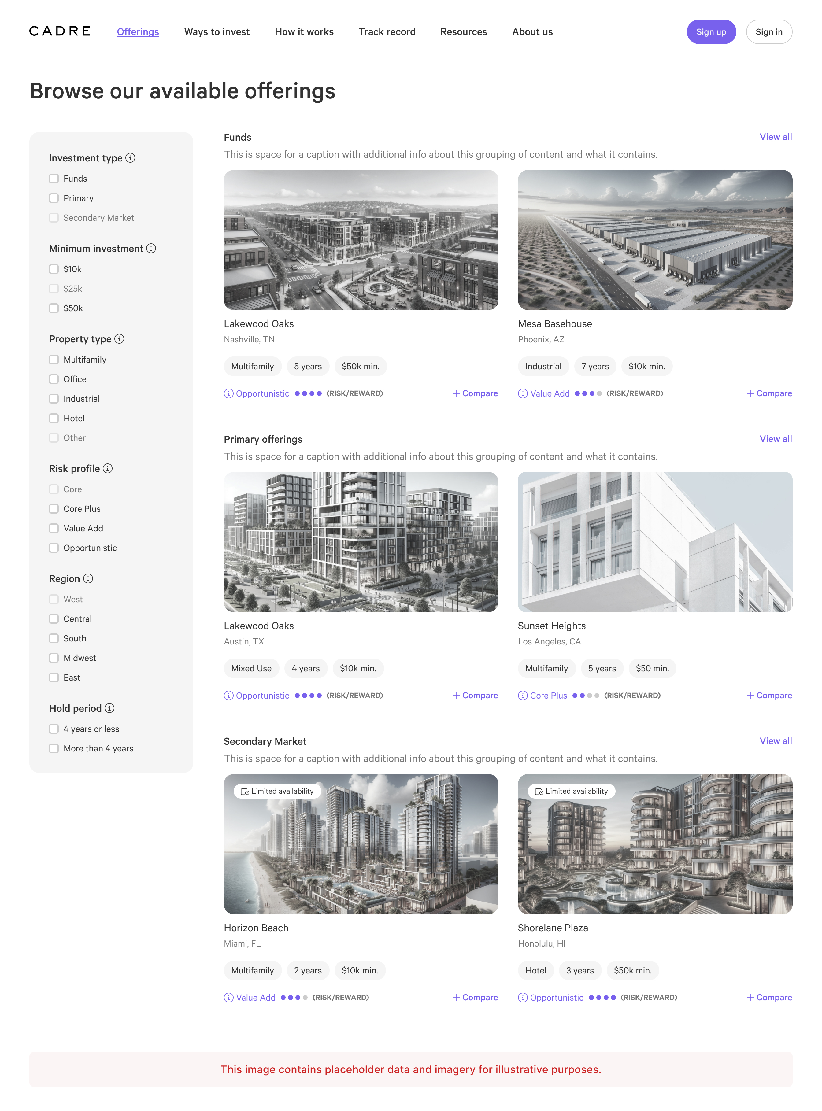
The browse experience for Cadre.
Working on a team with just two designers at Cadre allowed me to have an impact on almost all areas of the product. One of the most impactful projects involved leading the design for an updated browsing experience.
Problems
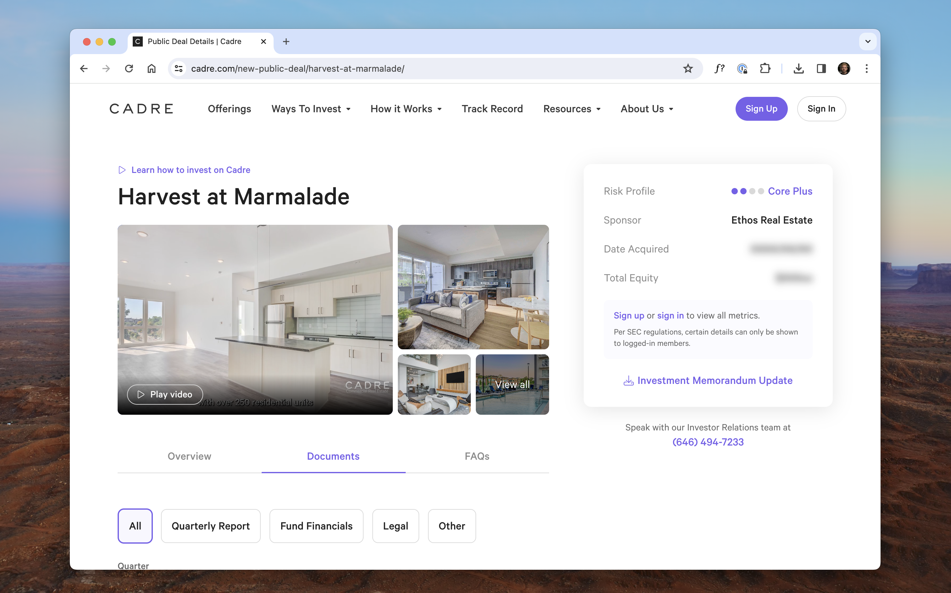
📈 Financial products can be difficult to understand. It was clear that users needed additional information to explain what we were offering.
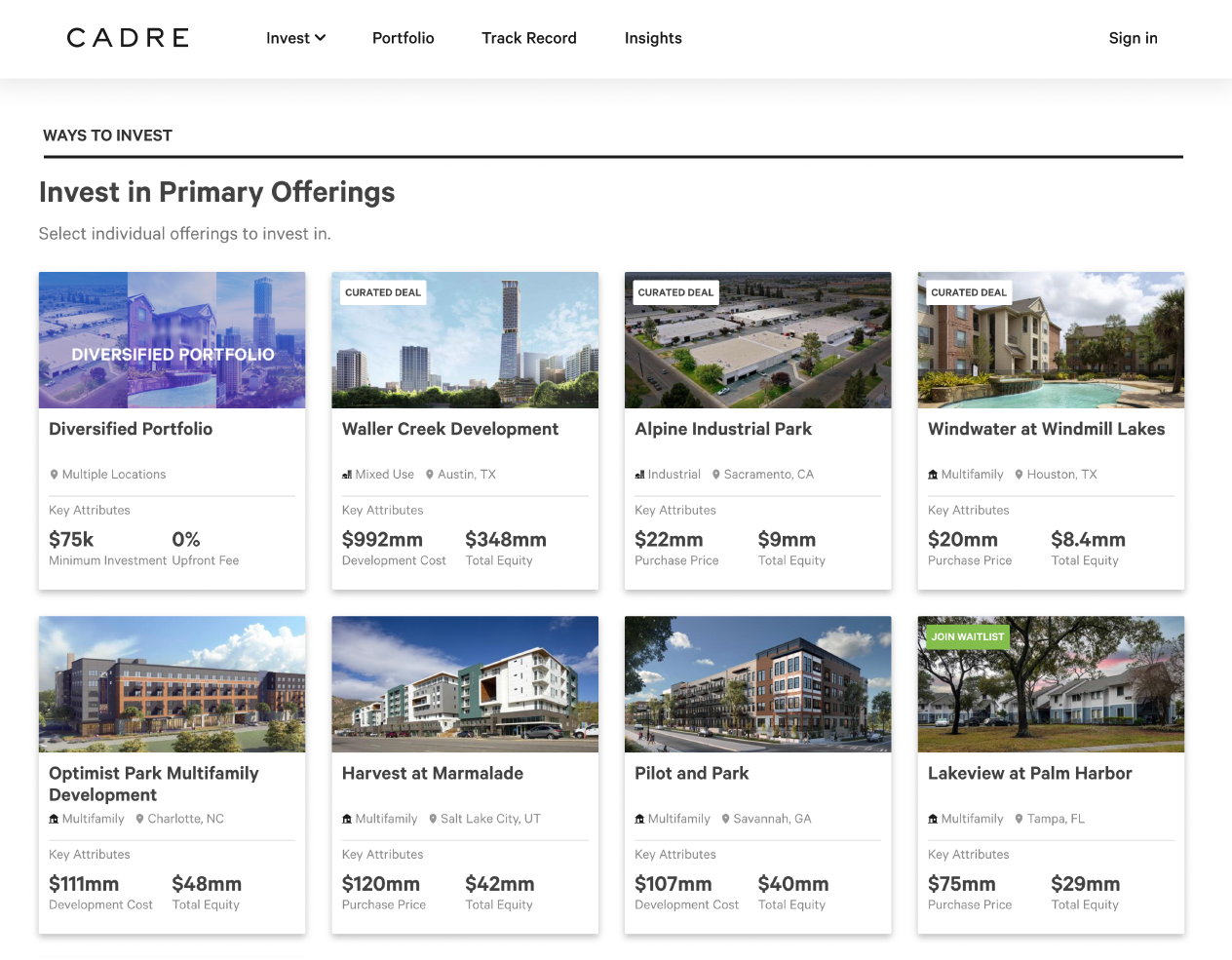
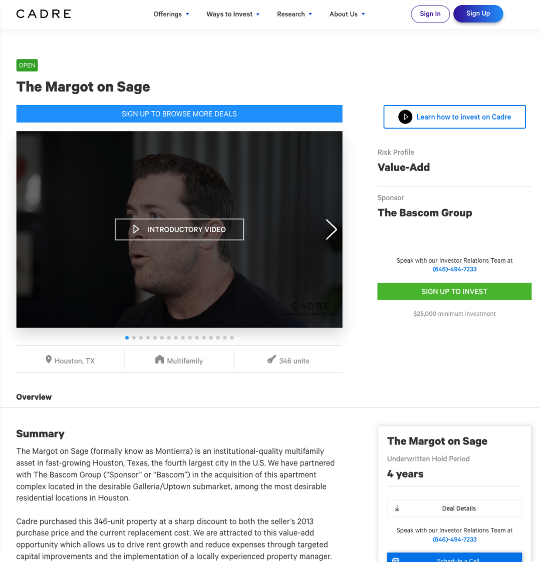
📈 The previous “browse” experience prominently displayed pieces of information that just weren't important for people when making an investment decision.
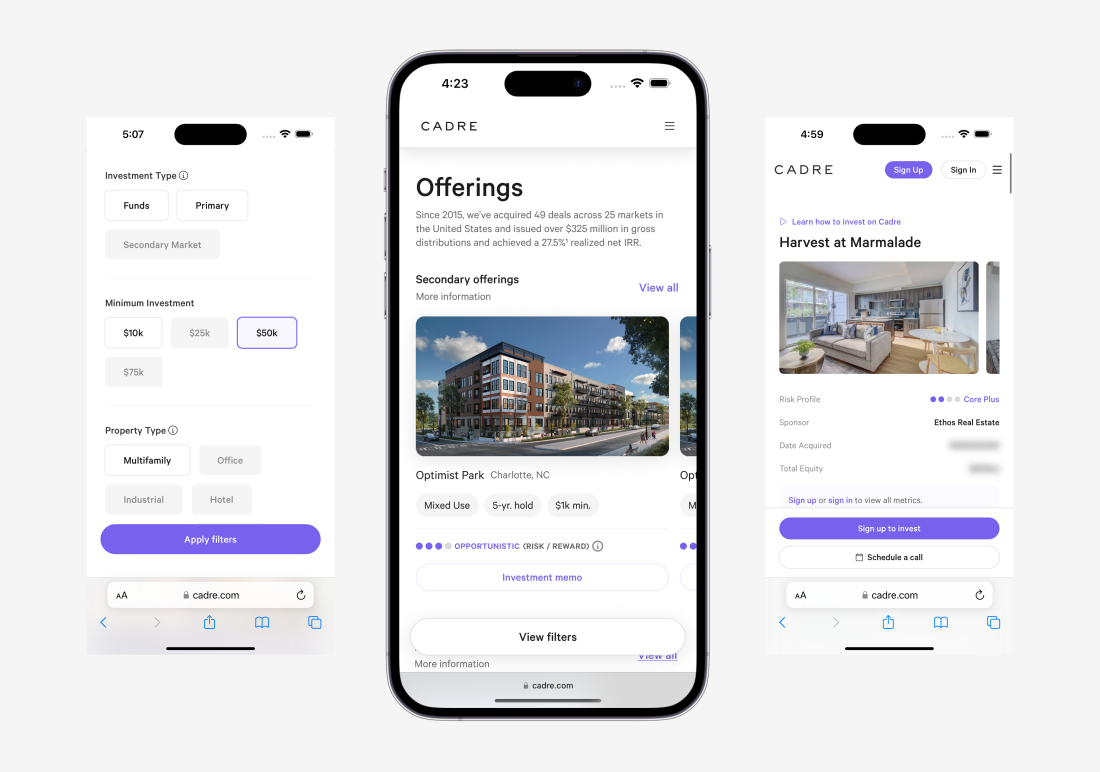
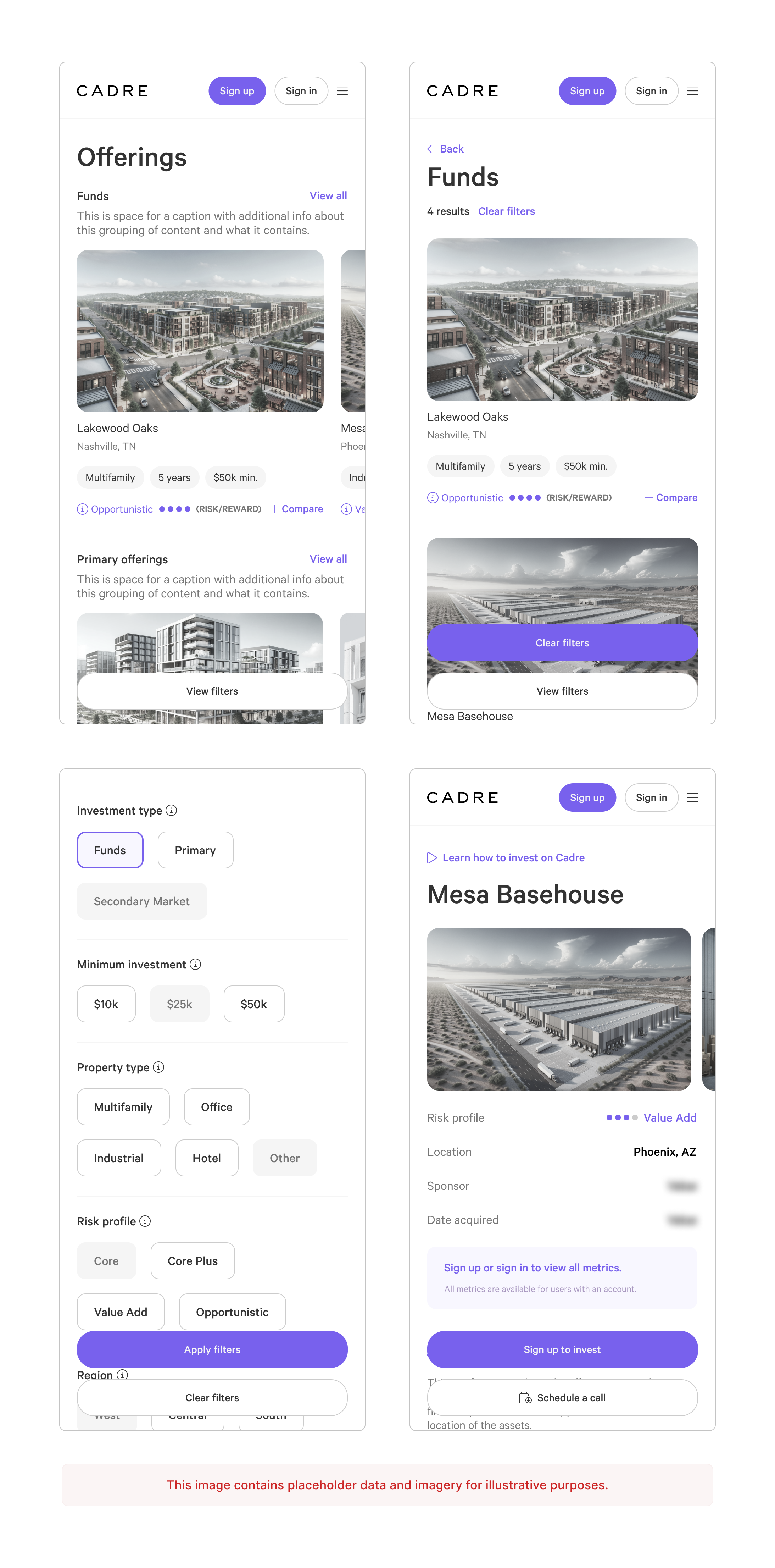
📈 While plenty of users were completely new to real estate investing, some users knew exactly what they were looking for. There was no functionality to quickly get them to the right content.
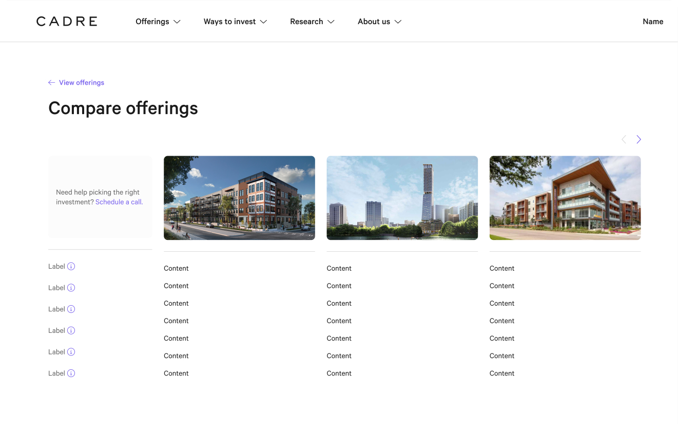
📈 Users expressed the desire to compare offerings. We didn’t have that.
📈 The UI needed to be overhauled. It looked outdated, pages used several button styles, and the mobile implementation was lacking polish.
Goals
💸 Increase users' understanding of the available investments.
💸 Allow people to compare investment options so they can make informed decisions with confidence.
💸 Prioritize the most critical information. Remove content that isn’t important for making an investment decision.
💸 Implement our new design system. Focus on the quality of the mobile experience. Modernize the look and feel.
